Let’s talk gear. (Spoiler: I keep it simple.)
I’ve answered questions about favorite tech gear, styling tools, and travel gear for years. It’s kind of wild that it took me this long to compile everything into a list. But—small biz owner life, I guess.
I’m happy to say it’s finally here, though, along with some examples of what I’ve used this gear to create. It’s organized into three sections: styling tools, travel and remote work essentials, and photography gear.
Now, if you're expecting a flashy list of just-released-yesterday tech... this probably isn’t that. I’m a firm believer in using what works, not what’s trending. My gear picks are minimal, intentional, and rooted in one guiding principle: don’t upgrade until your current setup is actually holding you back.
Someone once told me not to buy a new camera or lens until I wanted to create something my current gear literally couldn’t do, and honestly, that advice has saved me thousands. It’s also helped me get to know my tools inside and out, which means I spend more time creating and less time chasing upgrades.
So everything on this list? It earns its spot. Whether it’s a styling tool, camera, or something I toss in my carry-on, it’s here because it’s simple, it works, and it serves a very specific purpose in my creative workflow.
Bookmark this page and check back—I’ll keep it updated as my gear evolves. Or scroll down to get the free PDF download.
(Note: The majority of these are Amazon affiliate links connecting to the various brand shops. Feel free to search out your own sources for each. But thanks for your support if you purchase something through a link.)
Styling Tools
8x8-Inch Mat Boards
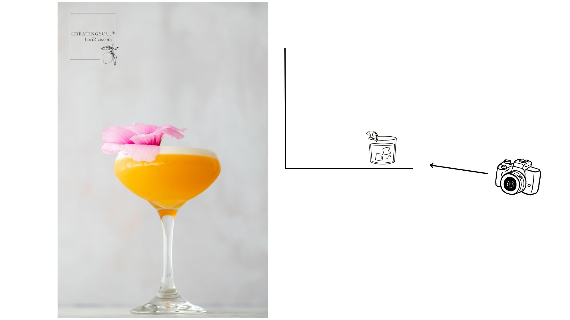
The most essential tool in my studio is a small foam core board or mat board to bounce light on a small subject like food. I used a small whiteboard for years, but then I found these! One side is white and one is black. So versatile on set!
Spring Clamps
A must-have for folding up my mats and foam core boards. The 2-inch are great for the small mats above. I use 6-inch for larger boards. Note - The orange can reflect, so opt for black, but you can always just drape a linen over the handle to cover it.
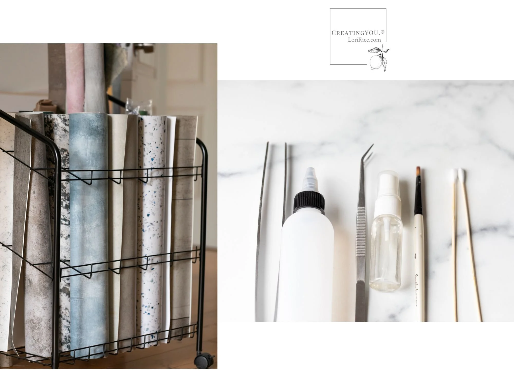
Rolling Cart to Hold Vinyl Surfaces
I love this cart. It holds all my vinyl surfaces as well as my rolled painted canvas and contact papers. The best part is it’s light and moves so I can easily roll it out of the way or closer to set.
Spray Bottles for Water, Oil and Glycerin
These small bottles help me to control the spritzes on set and pack away easily.
Museum Sticky Putty
I can’t live without this stuff. It holds utensils in place, keeps a blueberry from rolling off set, holds down the corner of a surface, or secures it to the wall.
Condiment Bottles
I’ve used bottles like this to apply condiments for years, but I recently purchased these for a workshop I was teaching. They are perfect and now my go-to for ketchup, salad dressing, chocolate sauce - you name it.
Gaffer Tape
Another must-have to secure vinyl surfaces to my wall as backdrops.
Cotton Swabs
For quickly cleaning up a drip of dressing or the side of a soup bowl. Standard bathroom cotton swabs work, too, but I like the long sticks on these if I need to reach into a plate or bowl without disturbing anything with my fingers.
Diffuser
The diffuser/scrim I use most often when I need one. I also recently found this small diffuser that is perfect if you hike to sets outdoors. I also have one similar to this extra large diffuser that will cover a whole window or doorway.
Curved Serrated Tip Tweezers
Six to seven inches is the length I like for moving around little bits from beans to basil leaves and salt flakes.
Long Kitchen Tweezers
For styling pasta.
Paint Brushes
Several sizes for applying oil or water to produce, breads, and meat.
Dulling Spray
Love this stuff for shiny spoons and spatulas. It will dull the surface so you don’t see your own reflection in the shot.

Styling Kit Bag
Just a simple travel toiletry bag that I find has space to hold everything I need and plenty of compartments.
Rolling Chef’s Cart
If you move around your space a lot, I have loved having one of these. I can prep on the top surface and have all my styling supplies below. It rolls right up to the board/surface I’m shooting on.
Baker’s Rack
Choose the size based on your space. I have used lots of different shelving to store my props and a simple baker’s rack has always been my favorite solution.
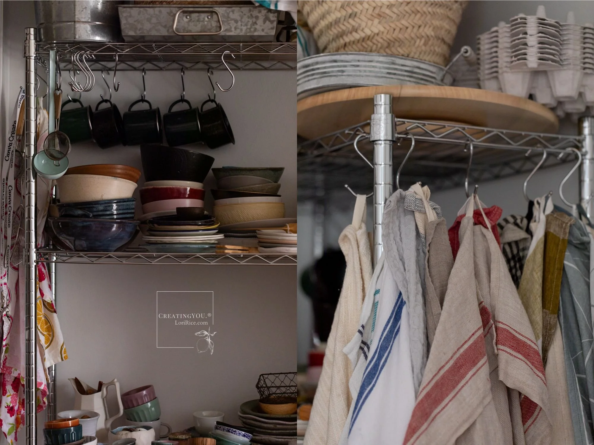
S-Hooks
Another reason I like baker’s racks is the ability to use these hooks to hang other props such as linens or utensils off the side.
3-Step Ladder
This is the style of ladder I use for overhead shots and to get a higher angle over my subject. I find the 3rd step essential to get me tall enough.

Travel and Remote Work Essentials
Single Camera Bag
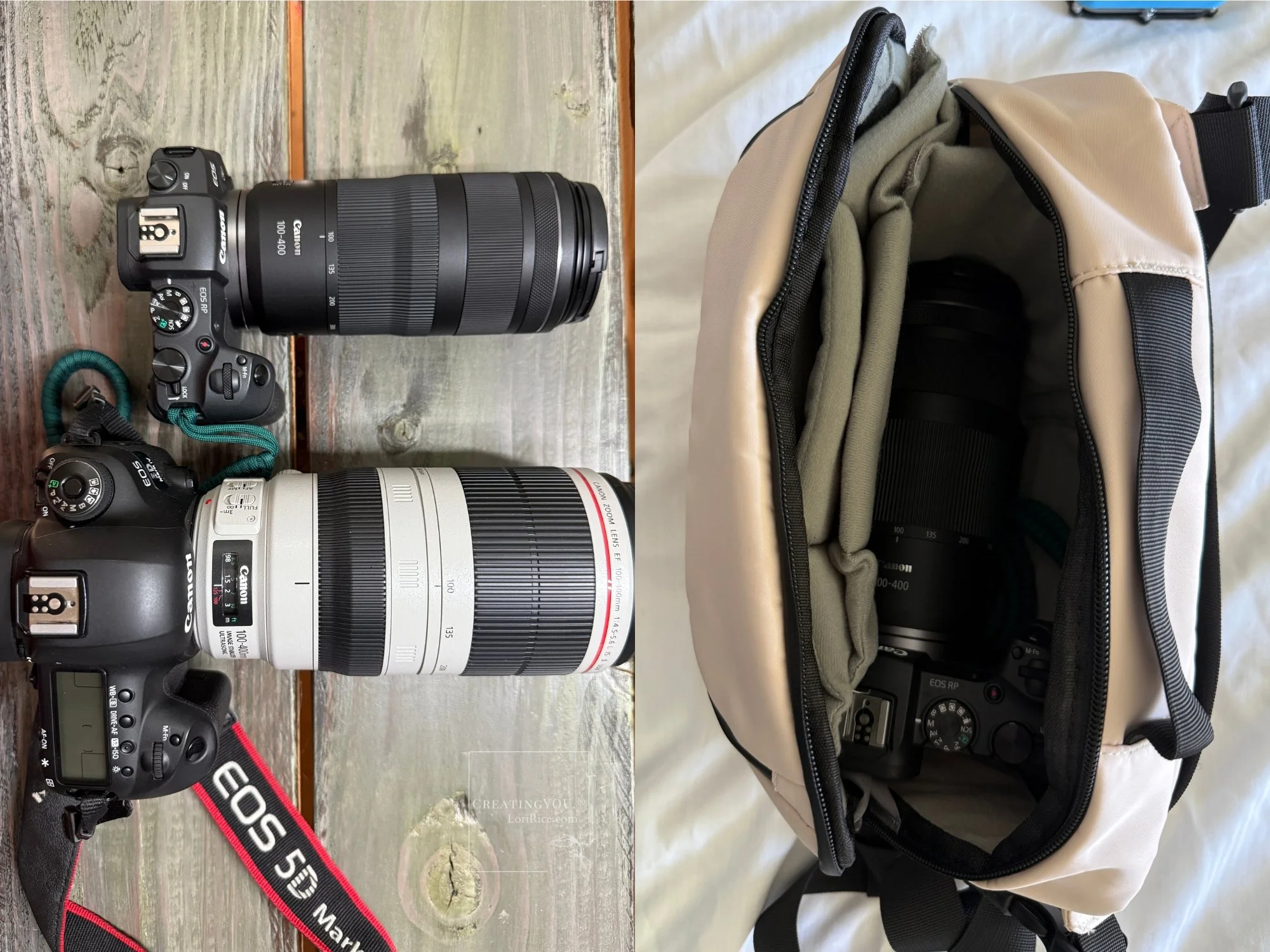
I have tried so many different bags for travel when I take only one camera without much luck. I got this waterproof bag before our trip to the Big Island, and it has been perfect! It’s ideal for one camera and a lens with an extra battery and camera card, with space for my phone and wallet. I use it for my Canon Mirrorless EOS RP with my 100-400mm lens when traveling.
DSLR Backpack
It also took me forever to find the right backpack to carry all of my gear when I need it. I’ve had this for a few years now, often carrying it back and forth every day when I work on-site and when I had a studio outside my home. I’m so pleased with how it has help up because I weight it down! It will hold my Canon 5D Mark IV, my 100-400mm, 24-105mm, 100mm macro, and 50mm. Plenty of space batteries and camera cards. And a spot for my laptop (now a 13-inch Macbook) and my iPad Pro.
Samsung T7 Portable SSD
I run Lightroom Classic on my laptop, but I don’t want the photo storage to slow it down. I got this a while back to support the raw file storage. It’s slim and fast.
SanDisk 1 TB Extreme Portable SSD
I use this to back up remote shoots when I’m on the road as an extra measure of security in case I’d lose a card or have one fail. I copy all photos from my camera’s SD card to this drive through my laptop. Once those images are edited and safely in my storage archives, I delete them from this drive. I used this a lot when I was on the road photographing the California Farm Table Cookbook.
Underwater iPhone Housing
A great option if you travel or work near water. I’ve filmed swimming pigs in the Bahamas and sea turtles in Hawaii.
Zip Bags
Creating small compartments to hold things either in my laptop bag or while traveling is essential for me. I use these bags everywhere I go. With all the different sizes they hold camera cards and batteries, separate my notebooks and journals from the rest of my bag, and I use them for one change of clothes in my backpack when I need it. It makes things really easy to find quickly and separate from the millions of other things I always seem to be carrying.
Camera Gear
Canon 5D Mark IV
I know the world is moving to mirrorless, but I will never stop loving this camera. I use it for all my double exposure and when I first got it several years ago, it changed my photography forever.
Canon EF 24-105mm f/4L IS USM Zoom Lens
The lens I have used most in my work by FAR. I love it for food and table scenes.

Canon EF 100mm f/2.8L IS USM Macro Lens
I have to admit, I got this lens because another food photographer raved about it. Then I didn’t use it for food at all for a very long time. Now that I photograph more in my garden, I love it. And I use it for all my double exposure floral photography. While I use it a lot more these days, I still rarely use it on set for food.

Canon EF 50mm f/1.4 USM Lens
Like many people, this was my first food lens. It worked great for me until I transitioned the 24-105. These days I use it most often for overhead flatlays. I used it for travel with my DSLR before I got my mirrorless.
Canon EF 100-400mm f/4.5-5.6L is II USM Lens
What I use for my wildlife shots. It’s definitely a great one to start with. Heavy and I’ve transitioned to mirrorless for travel, but I still use this every week.
Canon EOS RP Full Frame Mirrorless Camera
My DSLR is still working great for me, so I’ve only tiptoed into mirrorless. It took me a while to decide, but I had to return to my main goal - to have something lighter and smaller for travel. While this is considered entry-level, it has been excellent for me. I’m thrilled with my choice to get it.
Camera Wrist Strap
I opted for a wrist strap instead of a neck strap for my mirrorless and I love it. The camera and lenses is so light, this is the best way to carry it in hikes and walks through cities.
Canon RF50mm F1.8 STM Lens
I didn’t like the results from using the adapter to connect my DSLR lenses to my mirrorless (a common complaint), so I got this 50. It makes things compact and a great setup for travel.
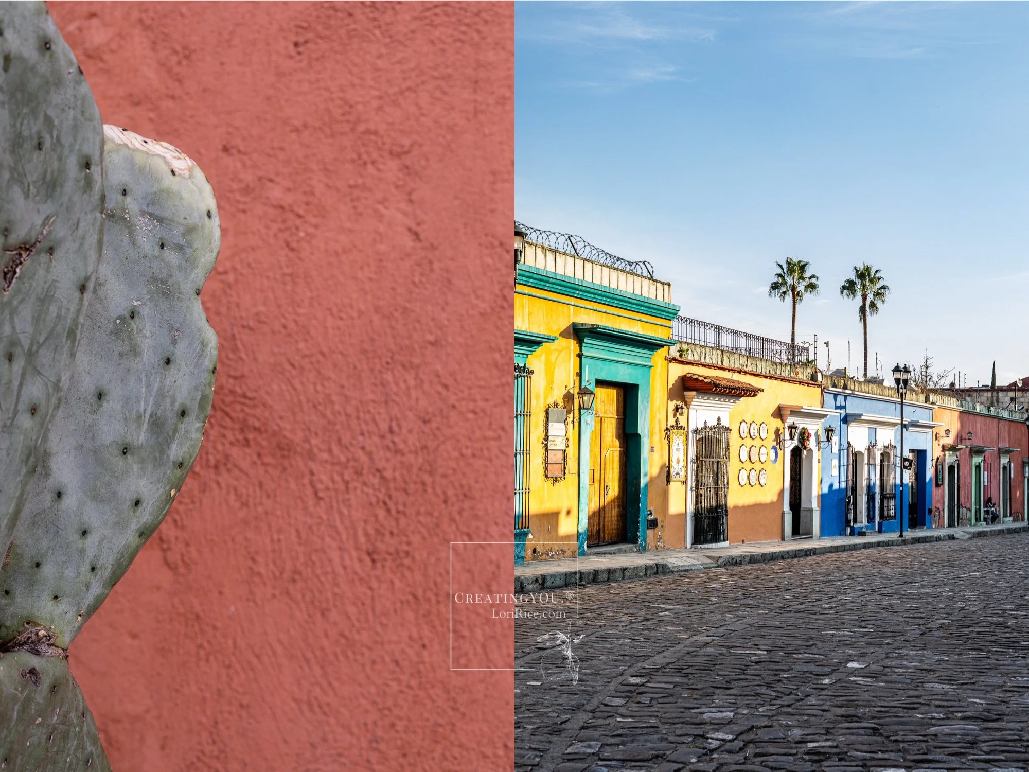
Oaxaca Background and Textures Pack available for licensing at Creative Market.
Canon RF100-400mm F5.6-8 is USM
I found myself wanting a wildlife lens that I could travel (really, fly) with and hike with that wouldn’t be heavy. I decided to give this 100-400mm for my mirrorless a try. I am loving it so far. It’s not quite as powerful as my DSLR set up (fps are fewer on the mirrorless), but it has been capturing birds, sea turtles, and deer really well. And it is SO light. I carry it with the wrist strap in one hand with no problem.

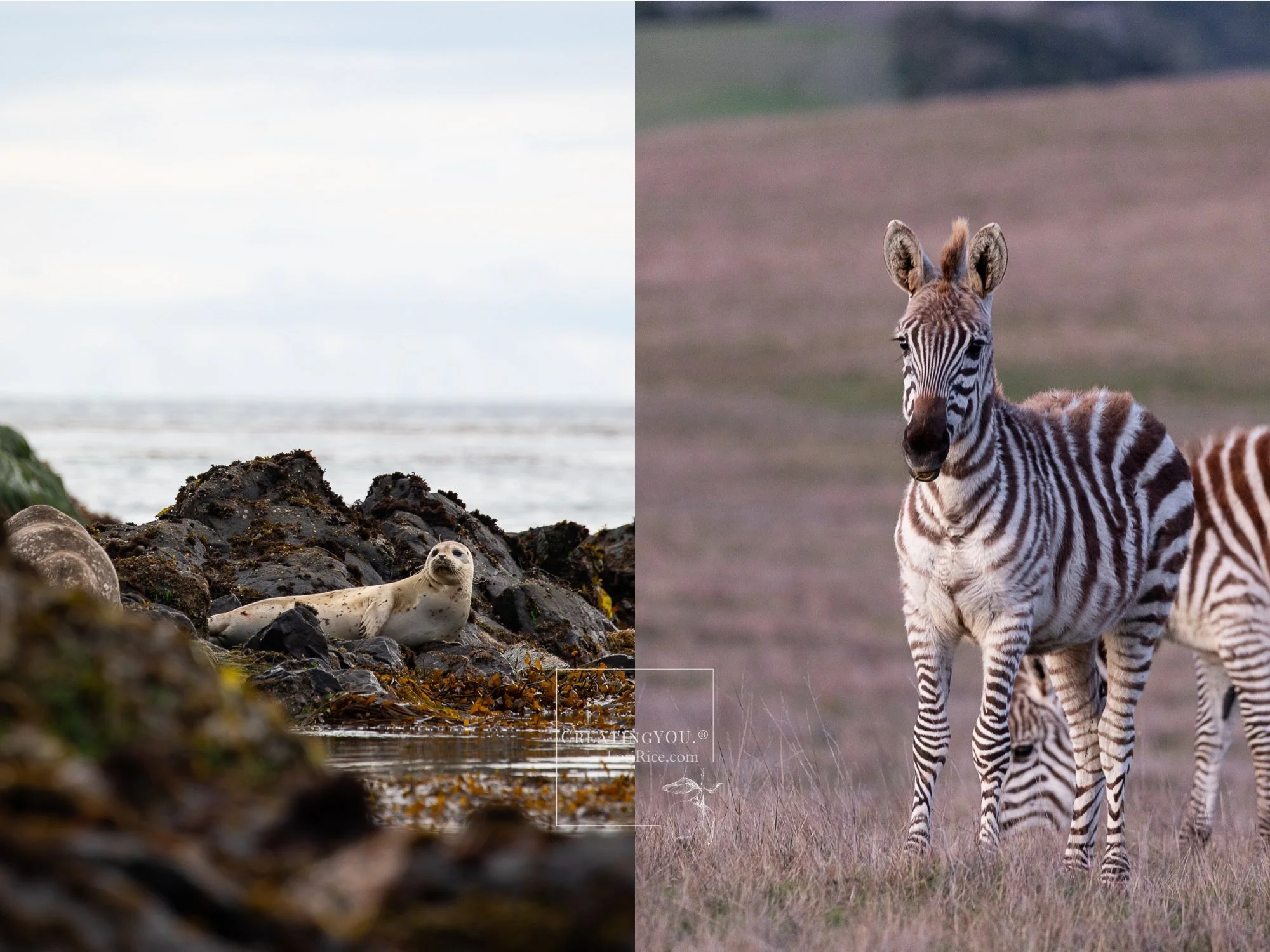
Both photos available for licensing on The Luupe.
Camera Remote Control Wireless Shutter for Canon
It took me a long time to find a wireless remote that I really liked. This is it. It’s compatible with my DSLR and my mirrorless. It’s been great for continuous shots that I turn into stop motion and stills.
Grab this list in a free download.